Plotting
Collection of things to remind myself how esoteric plotting things work.
I recently found a modern scientific visualization book (published in
November 2021, GitHub, text) that so far seems to do a better
job than my legacy resources for making good matplotlib graphics. The
first section describes how you actually compose and create the plots,
while the second section describes figure design and other
considerations.
At this point, I am beginning to run into issues with using altair for
visualizations unless I very tightly scope them and avoid in-notebook
rendering in favor of a stand-alone HTML document. There is still a good
use for altair in my everyday work, but using a more powerful as well
as non-interactive render will be good to move back to for most of my
work. Over time, a seaborn-like collection of my common security plots
based on matplotlib will be more beneficial than one based on altair
for reuse and distribution. Finally, the plot functionality in shap
uses maptplotlib, making my improved understanding of it more
important there too.
Rules for visualization
The following guidelines should be kept in mind when building a plot. Probably unsurprisingly, many of these are really similar to what I've been learning (and improving) with interpersonal communication.
- Know your audience
- Identify your message
- Adapt the figure (message) to the support medium
- Captions are not optional
- Do not trust the defaults
- Use color effectively
- Do not mislead the reader
- Avoid "chartjunk"
- Message trumps beauty
- Get the right tool
Color maps
There are a number of color maps available for plotting. In many cases,
a perceptually-uniform sequential color map will be the best choice.
These style maps are available in matplotlib:
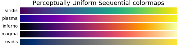
The cividis color map is an improved viridis map that takes into
account human perception and vision deficiency (see paper).
Additional color maps are displayed on matplotlib's documentation.
SHAP customizations
The default shap partial dependency plots are useful, but depending on
the underlying data may not be the best default. You can achieve an
improved "default" plot with the following:
...  # imports, prep, modeling, etc.

shap.plots.scatter(
    shap_values[:, "feature_name"],
    color=shap_values,
    dot_size=2,
    x_jitter=1,
    alpha=0.2,
)
p = plt.gca()
...  # further customization
Terminal
You can plot within the Terminal when using OSX and iTerm2 using the
imgcat module.
import matplotlib
matplotlib.use("module://imgcat")
import matplotlib.pyplot as plt

plt.plot(range(10))
plt.show()
The module can be installed with python -m pip install imgcat as it is
not available through Anaconda. This will not work with other terminals,
but the sixel backend may support this.
Given the prevalence of notebooks as well as VSCode's support for them within the editor, it will be rare for me to actually need this, but it is an interesting use of a lightweight plotting environment.